You might be seeing it everywhere (and you might even hate it), but white subway tile is not a new thing. It’s been around since the 1900s when it made it’s grand debut in NYCs very first subway station. So now you know where it got its name! People at that time were really into hygiene, and the tile was a hit because it was easy to wipe clean and didn’t stain. Eventually, it made its way into other spaces that the Victorians wanted to keep looking sparkly clean: kitchens and bathrooms. And for close to a century, it didn’t lose its charm. Until now. And boy do we need some fresh subway tile ideas.
Because in the last decade or so, no matter where you looked, you couldn’t escape it. Like any design element, when you see it everywhere, it doesn’t feel special anymore. It becomes boring. And to make matters worse, white subway tile became synonymous with builder-grade finishes and flipped homes. The Scarlet letter of the design world.
No matter what the haters say, subway tile isn’t going anywhere. It’s classic, works with any look, and is durable. It is also very affordable compared to other materials like natural stone. But subway tile doesn’t need to be written off completely. It just needs to be shaken up a bit. So, let’s explore subway tile ideas that color outside the lines and make it interesting again.
Subway Tile Idea: Play with Patterns
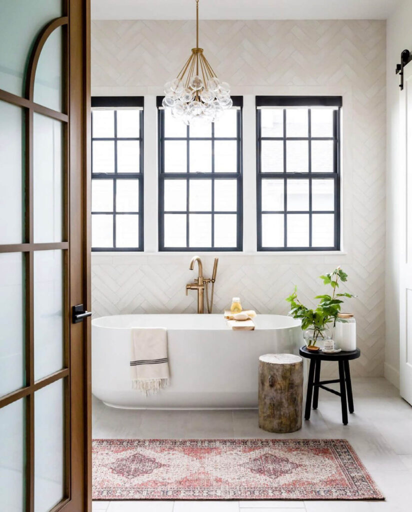
Picture white subway tile in your head, and you’ll probably see it in the traditional brick pattern as if it’s the only option. But really, there are so many different patterns to choose from, like the herringbone pattern seen here. In this bathroom, the floor-to-ceiling tile creates a cool focal point and adds some serious drama.
Or try a horizontal stack pattern. This creates a clean, modern look and gives white subway tile a fresh new feel.
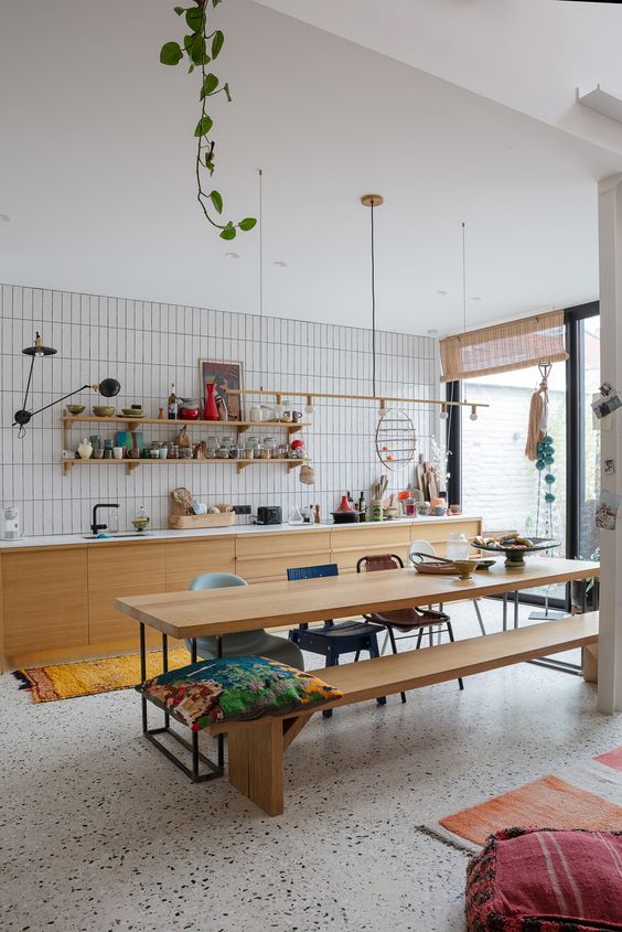
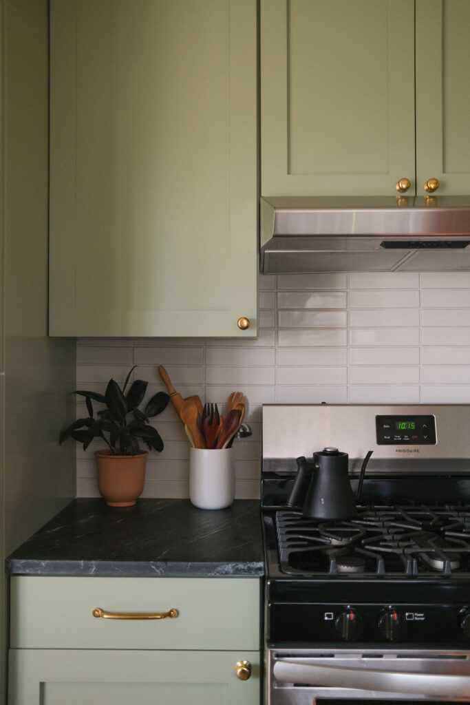
If you can go horizontal, you can go vertical. The vertical stack pattern is a great way to draw your eyes up and make your walls feel taller, like in the kitchen above.
Subway Tile Idea: Shake up the grout
Grout is such a neglected design element; don’t even get me started! Thin lines in a subtle white or gray/black for a bit of contrast are the typical look. But another subway tile idea is to think outside the box when it comes to grout. Check out the thick grout lines in the bathroom above. Not something you see every day.
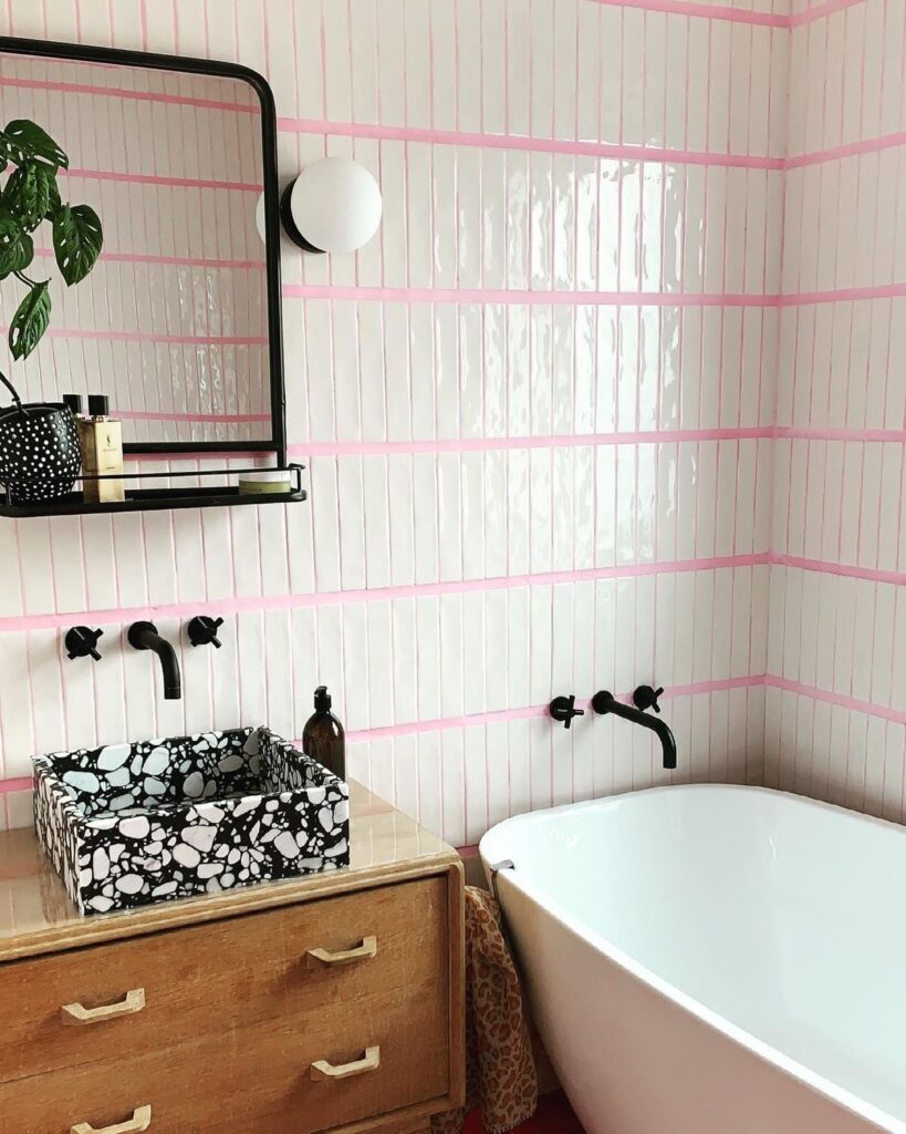
Believe it or not, there’s a rainbow of grout colors out there. This bathroom had fun with the size of the grout AND the grout color. Pink grout makes quite a statement.
Play with Color
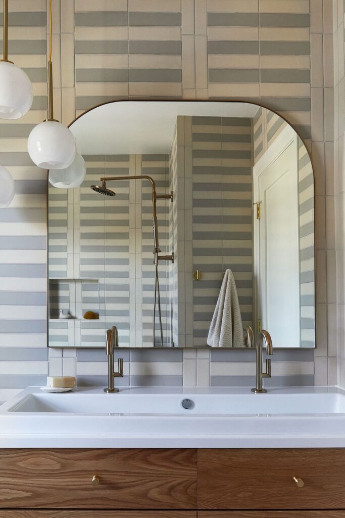
Don’t think you don’t have to stick to one color when using subway tile. Here, designer Magda Rauscher mixed in some light blue subway tile and shook things up even more by varying the pattern layout. You definitely can’t call this boring.
White subway tile is classic for a reason. But classic doesn’t have to mean boring. Sometimes, you just gotta get a little creative to take something from basic to special all over again. So what do you think about these subway tile ideas? Are you team white subway has to go, or do we think we can breathe new life into it?
+ view the comments